| PDF FILE - CLICK HERE FOR PRINTABLE WORKSHEET |
| |
|
It is well known, that colours influence our moods and feelings. Light colours are likely to make people feel more relaxed and darker colours create more of a serious, formal atmosphere. Classrooms are sometimes coloured in shades of blue and orange, as these are thought to promote learning.
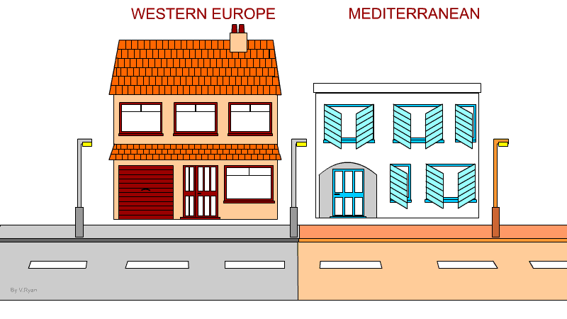
In the hot environment of Australia, it is normal to see cool colours, such as blues and greens on buildings (inside and outside). This is psychological, as it is thought to influence people, to think that the environment they are in, is cooler. In Europe, bright primary colours are used to promote the feeling of warmth, due to the longer winters and a colder climate.
In the hot / warm Mediterranean, where summers have high temperatures, many of the villas and homes are coloured white. This is to reflect as much sunlight as possible, away from the building. The aim is to keep the rooms inside cool. Often the window frames are coloured light blue. This is a Mediterranean colour scheme.
|
|
|
| |
|
|
|
|
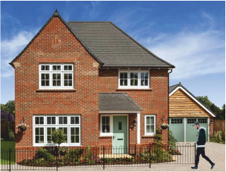
Most houses tend to reflect the dominant style and colour scheme of their location. For example, a typical town house in the UK, may have been constructed from red brick and have dark colours, for the doors and window frames.
However, changing colours can change the perception of the house, especially to potential buyers. Estate agents and house renovators, suggest changing the colour scheme to a ‘cool’ pallette, which includes light grey doors or grey brickwork, or even a turquoise coloured front door. This colour scheme is regarded as giving the house a homely feel.
A more modern house may have even brighter colours, including yellow, which is a modernist choice. |
| |
 |
|
This standard red brick house, has a colour scheme based on a cool pallette, giving it a bright, homely appeal, with white windows and lime green doors. |
| |
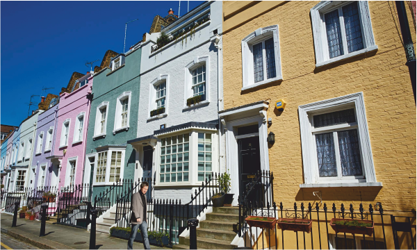
| The houses below, have individual colour schemes, according to each owners preference. None of the houses have a dark colour scheme. All are bright and lively, moving away from their ,original darker, Victorian colours. |
| |
 |
| |
|
|
|
|
|
Questions:
1. Using a holiday brochure, select a typical Mediterranean house/villa and draw it. Use appropriate colour and shade.
2. Using holiday brochures etc..., list the dominant colours, seen on homes in Northern Europe. Compare them to the colours schemes used on African homes/villas. |
|
|
|
|
CLICK HERE FOR
DRAWING AND SHADING TECHNIQUES INDEX PAGE |
|
|
|
|
|
|
|
|
|
|
|
|
|