EYE DROPLET SYMBOL - 1
V. Ryan © 2008-2021
|
EYE DROPLET SYMBOL - 1 V. Ryan © 2008-2021 |
| PDF FILE - CLICK HERE FOR PRINTABLE VERSION OF EXERCISE SEEN BELOW |
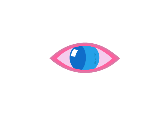
| The symbol seen below has been designed for a pharmaceutical company producing eye drops. The eye drops have been developed for tired eyes and help reduce irritation caused by dust and eye strain. The symbol is to be placed on the packaging as one of the main images. A focus group has carefully considered the symbol and decided that it does not entirely represent the soothing nature of the eye drops and the way in which the eye drops calm irritation. |
|
| What do you consider to be the best and most interesting aspects of this symbol? |
| How do you think the symbol could be improved? |
| Considering the colour scheme - do you feel that the colours that have been used accurately represent the product? Explain your answer. |
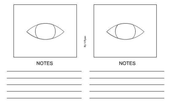
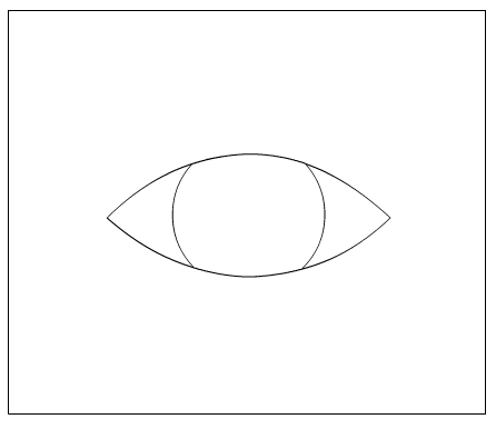
| Draw two initial designs for a new symbol that represents eye drops. Remember, the eye drops help reduced the irritation of tires eyes. A basic eye has been drawn within each box. Use the basic eye as the starting point for each initial idea and the outer box as a limit on the size of the new symbol. Include notes to help explain each idea. |
|
| Select your best design or a combination of features from both designs and draw a colour rendered final version in the space below. |
|
| Is your new design an improvement on the original? Explain your answer. |
| CLICK HERE FOR GRAPHICS INDEX PAGE |
|
|