|
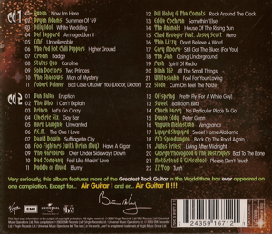
FRONT
ENERGETIC IMAGE: The image is playing an
invisible guitar (air guitar). This accurately reflects the title of the
album/CD. The title also reflects the rock music on the CD ROM.
:ARTISTIC FONT: The font is clear, bold and
strong. It is easy to read. It gives the impression of steel or a metallic
finish - reflecting some of the music contained on the CD ROM.
BRIGHT POWERFUL COLOURS: The colours are
bright and vivid. They are eye catching and reflect the type of colours
seen on a live stage (flood lights, fireworks etc...)
|
 |
|
| |
|
|
BACK
PLAIN FONT: The font is quite small and yet
easy to read. The layout of the tracks is easy to follow.
DARKER COLOURS: The colours are darker than
the front allowing the customer to read the tracks easily. Vivid colours
are not present as they may make the text difficult to read and could be a
distraction.
INFORMATION: Information is included on the
back including a bar code, various company logos and copyright
information. A promotional statement is also included.
|
 |
| |
|
| What do you think about the layout, colours,
fonts etc on the front and the back? |
| |
| |
| |
| |
| |
|
| ANALYSIS OF A MUSIC CD ROM |
|
 |
|
|
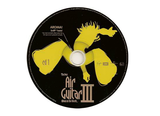
ENERGETIC IMAGE: The image
is playing an invisible guitar (air guitar). This accurately reflects the
title of the album/CD. The title also reflects the rock music on the CD
ROM. The image is in one colour only and is a silhouette of the image on
the front cover.
FONT: The font is clear, bold and strong. It
is easy to read as it is plain.
CONTRASTING COLOURS: The colours are
contrasting black and yellow. They are a much simplified version of the
front cover.
INFORMATION: Information is printed on the
disk and around its circumference |
| |
|
| What do you think of the colours used on the
CD ROM? |
| |
| |
| |
| Do you think the CD ROM has impact? |
| |
| |
| |
| What do you think of the image used in the
centre of the CD ROM? |
| |
| |
| |
| Are CD ROMs always round / circular? |
| |
| |
| |
| |
|
CLICK HERE FOR DESIGN EXERCISE |
| |
|
|
CLICK HERE FOR
GRAPHICS INDEX PAGE |
| |
|
|