|
Below are a number of logos often seen on environmentally friendly packaging. Packaging that is composed of recycled card and card provided from sustainable suppliers. |
||
|
|
Placed on the packaging of a product that is partly or completely manufactured from recycled materials. usually the percentage of recycled materials used is displayed. |
|
|
|
Nordic Swan - The Swan is the official Nordic Eco-label, introduced by the Nordic Council of Ministers. The Swan logo demonstrates that a product is a good environmental choice. The Nordic Eco-labelling criteria are based on evaluation of the environmental impacts during the life cycle of the product. The inks are alcohol-based or water-based and are not hazardous to health or environment. There are also no chlorinated plastics or heavy metals in the products. |
|
|
Green Dragon - Is awarded to companies who set up management systems that ensure that sustainability and protecting the environment are high priorities. The management system is composed of Planning, Taking Action, Checking Progress and Reviewing Achievements to realise continual environmental improvement. |
||
|
|
The Green Dot (Der Grüne Punkt) - The manufacturers of these products have paid for the collection, sorting and recycling of the product's packaging. Most packaging is only used once, but this does not mean that it automatically becomes waste. The valuable raw materials from which packaging is produced can be used to manufacture new products. Since 1990, the Green Dot has been making sure that used packaging is collected, sorted and recovered in line with the German Packaging Ordinance. |
|
| QUESTION | ||
|
|
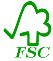
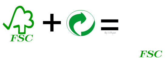
A. This logo belongs to the FSC, The Forest Stewardship Council. The FSC promotes the responsible management of forests through sustainable forestry. The FSC has defined high standards of forest conservation and management. Any packaging with the FSC logo has been manufactured with conservation and the environment in mind. |
|
|
|
B. The logo opposite represents the Green CD Program. This means that manufacturers have used biodegradable inks for their printing and packaging that is FSC approved. It also means that the manufacturers have reduced carbon emissions. |
|
|
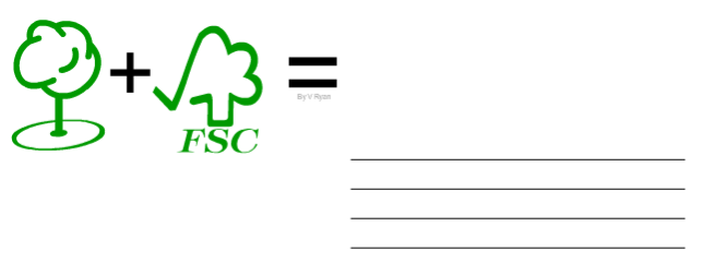
Why are trees used on both these distinctive logos? |
||
|
Analyse the FSC logo (A). Companies than manage their forest correctly are allowed to display this logo. What part of the logo suggests that the company is managing the forest correctly? |
||
| What part of the Green CD Program logo suggests that this logo is for CD packaging manufacturers? | ||
| Why is green the colour used for both logos? | ||
|
Combine the best aspects of both logos to produce a single logo that represents care of the environment within the CD ROM /DVD industry. You can only use aspects from both logos, no new aspects can be added. Include notes to explain your combination design. |
||
| SAMPLE ANSWER | ||
 |
||
|
|
||
| CLICK HERE FOR GRAPHICS INDEX PAGE | ||