| PDF FILE - CLICK HERE FOR PRINTABLE WORKSHEET | ||
| Designers have a large range of colours at their disposal and most are well aware that colours are associated with feelings and emotions. Designers, companies and manufacturers use colours cleverly, to promote a certain feeling about their products. | ||
| RED | ||
 |
FEAR WARNING BLOOD ANGER DEBT - IN THE RED PASSIONATE AGGRESSIVE IMPORTANT - THE RED CARPET |
|
| Red is a bold, striking colour, often used to ‘grab’ attention. It has a variety of contrasting meanings, such as ‘be cautious’. At the same time, it is regarded as a lucky colour in some cultures. Red must be used carefully, especially in advertising, as over use reduces its impact and ability to attract the attention of potential customers. Designers often use softer shades of red. |
||
| GREEN | ||
 |
CALM SERENE ENVIRONMENT PLANTS NATURAL GREEN WITH ENVY EVERLASTING NATURAL STABLE PROSPEROUS |
|
| In recent years, the colour green has come to represent the environment and environmental issues. It is associated prominently with politics, for instance the Green Party. Green is also associated with outdoor activities and nature. It is regarded as one of the most ‘restful’, or even neutral colours. Green is a colour associated with money and finance, probably because of the US dollar (once called the ‘greenback’). | ||
| YELLOW | ||
 |
HAPPY BRIGHT LIGHT FRIENDLY WARNING ENERGETIC |
|
| Yellow is a common colour, linked to happiness because of its brightness. It is often used in conjunction with red and orange. Yellow is regularly used as a background to warning signs and high visibility signs. Traditionally, yellow implies cowardice, which is the only negative connotation. | ||
| PURPLE | ||
 |
DREAMS PURPLE STRETCH (THINGS GOING WELL) LENT - RELIGIOUS REPENTANCE LUXURIOUS MYSTERIOUS ROMANTIC |
|
| Purple has been associated with wealth, success, luxury and even royalty for centuries. Often used as the colour on expensive / quality products. However, it is also associated with mystery and sometimes sadness. The Forty Days of Lent, which comes before Easter, in the Christian calendar, is a time when statues in churches are covered in purple cloth, as this colour is associated with mourning. In contrast, lighter shades of purple, are associated with romance. | ||
| ORANGE | ||
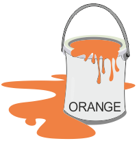 |
WARMTH ENERGY HAPPY PLAYFUL SUNSET CHEAPNESS HEALTH VIBRANCE |
|
| Orange is associated with energy and being energetic. A number of energy drinks, have orange as their colour. Orange is often used on packaging in place of red, as it is regarded as a safer colour. Impulsiveness and youthfulness, are also associated with orange. | ||
| WHITE | ||
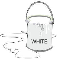 |
PURE HONESTY HYGIENIC HEALTH CLEAN GOODNESS EMPTY VIRTUOUS |
|
| The direct opposite to black and a primary colour. It is often use alongside other colours, helping to enhance them and as a contrast. A popular colour during winter, due to the emotional attachment many have to snow and Christmas time. White is associated with righteousness and honesty. | ||
| BLUE | ||
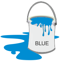 |
THE SKY OPENNESS COLD COOL ICE CHILLED SERENE TRUSTWORTHY INVITING |
|
| A very popular colour, as it is associated with trust, security and safety. It is claimed that this colour, has a calming influence on people. Therefore, it is often used in schools and classrooms. Government organisations and websites incorporate blue, due to its associated meanings. Blue is associated with the sky and water, which in turn are associated with calmness and relaxation. Darker blues often have more series or sombre associations, whilst lighter blues are associated with fun and relaxation. | ||
| BROWN | ||
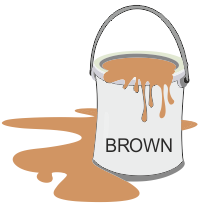 |
EARTH / SOIL TREES / FORESTS NATURAL WOOD THE OUTDOORS RUSTIC ENVIRONMENT STURDY RELIABLE |
|
| A less popular colour than most. This colour is often applied in conjunction with green, linking it to the environment. Utilised by companies associated with DIY, Building and Construction. This is a strong colour, that is often softened with degrees of white, providing lighter shades, especially when texturing the surface of drawings representing wood or leather. | ||
| GREY | ||
 |
GLOOM FORMAL OCCASIONS NEUTRAL BORING SUBDUED RAINY DAYS |
|
| Grey is often seen as a background colour, upon which brighter colours are overlaid. Regarded as a neutral colour or neutrality. Dark grey is sometimes a replacement for black (which in certain circumstances, is too bold / strong / dominating). Grey is sometimes associated with the meaning of boring, as is not an ‘exciting or energetic’ colour. Associated with dull, rainy days. A subdued colour, lacking impact. | ||
| BLACK | ||
 |
BOLD STRONG SOPHISTICATED POWERFUL MYSTERIOUS ELEGANCE |
|
| The strongest of colours, commonly used for text / printouts. Associated with sophistication, elegance and mystery. Has impact, especially when used on posters or banners. Sometime associated with fear, such as the ‘dark of night’. | ||