| PDF FILE - CLICK HERE FOR PRINTABLE WORKSHEET | |
| A style of writing can suggest an image / feeling or atmosphere. Designers and advertisers are very careful to select styles that produce the right image for their product. For example, a sports deodorant container is likely to have a font that suggests strength and movement. The colours will be bold and vibrant. | |
| Even plain fonts can be altered to produce the correct feeling or atmosphere. Look at the two examples below | |
| EXAMPLE ONE | |
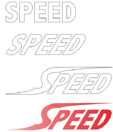 |
The font opposite fails to represent speed as it is plain, static (not moving) and has no colour / shade. The font has now been altered. The letters have been angled forward. This can be achieved by adopting an ‘italic’ style. The plain ‘S’ has been replaced with a stretched version. The top and the bottom of the letter tapers. Red is the selected colour and it slowly fades to the left hand side. The font now represents speed and movement. |
| EXAMPLE 2 | |
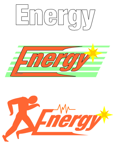 |
The word ‘energy’ seen opposite is written in a plain style. It does not reflect the image of energy at all. However, it can be altered in simple ways to produce the right atmosphere. The lettering has been angled and the first letter altered so that the top and lower parts of the ‘E’ extend almost across the length of the word. Orange is the main colour as this suggests, energy and warmth. A star has been added to give a little ‘sparkle’. The light green background suggests ‘environment’ and freshness. In this example the lettering style remains the same and the background has been removed. An athletic image has been added to reinforce the feeling of movement and energy. A ‘heart beat’ pattern has been included as well. |
| CLICK HERE FOR PRODUCT DESIGN INDEX PAGE | |